Negatives are like old friends or foes stashed away. Slivers of the past secreted in acid free glassine sleeves, their positive images looking back at them from that mysterious, miniature little window into the past, the contact sheet.
I’ve got binders full of them. Unlike my sentient friends and foes I can revisit this band of brothers and make little changes. Fix mistakes, or maybe just reminisce. It’s remarkable how infrequently we go back.
The negative itself can’t be changed, but you can change how you print it, drawing out different bits and pieces, maybe hiding some others. To paraphrase Ansel Adams, the negative is like the composer’s score, the print is like the performance. Everyone has seen enough bad performances of well known music to appreciate the fact that this analogy can be taken to extremes, but it can also be nuanced.
Digital files are like negatives, except for the shelf space, corporeality, and the nearly tactile aroma.
Summertime. July. With no remunerative photography in front of me, I am trolling old files looking for ailments to cure, amends to make, or an overlooked scrub to bring off the bench.
I found it in a photo that had been something of a star.
It and a handful of its companions traveled well on my social media accounts, were very popular on RadioMidcoastWCME, and all the folks connected with Brunswick High’s Production of Phantom of the Opera spread it far, far, and wide. Over the last six months, the galleries from this show double the next most frequently visited page on this website.
But out of the camera it was not really what I would call a good photograph.
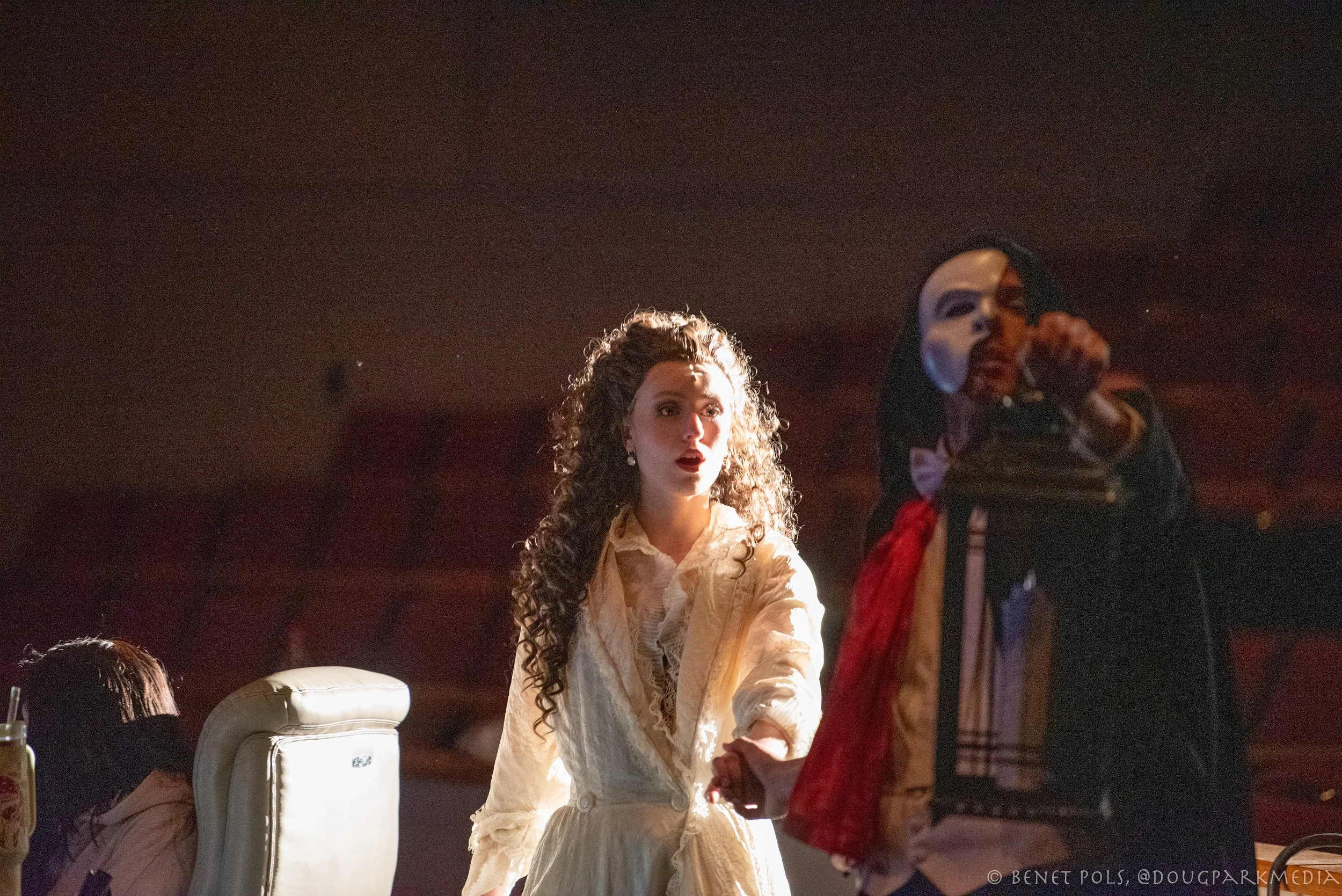
This version of this photo—straight out of the camera with no changes-—was taken the first day of dress rehearsals. As a result the cast, crew, lighting and sound group, the orchestra, and the directors were still adapting. I asked to photograph dress rehearsals for a publicity project for our local radio station, WCME; I wanted the host to have photos for the web, prior to to his interview with the leads and musical director the morning of opening night. I had also learned from shooting Anything Goes and The Great Gatsby that knowing what comes next is paramount; timing and position are everything.
Above is the unedited RAW file. The Phantom is leading Christine to his subterranean lair for the first time. They had come off the stage and moved up through the aisles and would circle back to a transformed stage. I don’t dispose of my RAW files after editing and exporting them from Lightroom—they stay on my computer like those binders on my shelf. At some point I move them to an external hard drive to make room for what is new.
My goal, after this Monday evening rehearsal, was to get a dozen or so images in decent shape for the web. Time was tight as the show opened on Thursday evening and I had my day job to think about. I was not going to let the perfect be the enemy of the good. I saw a couple of things I really liked in this photograph so I edited it quickly.
On the left is the tech crew. The spot light had flickered and moved about a fair amount as this was a first full dress rehearsal. I felt lucky to have grabbed a few frames with Christine lit while the Phantom was in relative darkness. The tech crew is something that in real time the mind’s eye would take care of—audience member’s minds would eliminate it just as our minds edit phone poles and cars from a scenic byway. But with a photo the cropping tool is necessary. The areas encircled in yellow were what I really wanted to save. The area circled in red—the left side of Christine’s face, hair and the outside of her left arm are blown out, a little too hot and a challenging edit. Getting this area’s exposure toned down without making it look smudgy is the spanner in these works.
The left side of Christine’s face is over-exposed. Matrix metering was on. Though I did use spot metering in some other scenes where a single performer was spotlit, I don’t think it would have benefited this scene. The performers were moving and the light moved to keep up with them so it was inconsistent—some times it led them, some times it trailed them.
Spot metering Christie’s face probably would have eliminated the diaphanous glow of her right arm and waist. The highlight on her trailing arm expressed any lingering doubts she may have had. Spot metering Christine’s face would also have completely obscured the phantom. He must be present, if dark.
One way to get a quick check on what is lurking in the depths of your RAW file is to click the “auto” edit button. It will quickly reveal some deficits in the file and—if you’re the type of person who whipsaws to panic easily—might make you ditch the file altogether. That could have easily happened in this case. Here is the original file with no edits at all save clicking “auto.” It’s not good.
The graininess is called noise, it’s short for signal noise, an artifact of the conversion of electrical “signals” into varying degrees of light. For those who care, I was shooting manually. For each frame I would choose the aperture, the time of the exposure, and the focal length. But rather than choosing a specific “film” speed, or ISO, I set the camera to auto ISO sensitivity control; it would choose the ISO depending upon the available light. I capped it at 6400 which is what the camera chose for this frame.. Aperture was f 2.8, speed 1/125. I had gone to full 200mm in focal length that this lens would allow. In this full frame image using the automatic edit feature, Christine’s costume is much less interesting.
Going back to the original unedited RAW file, I cropped out the tech crew (the tech crew and stage crew have a role in these productions that you can never appreciate unless you see them working at rehearsal), and cropped further to remove that bright reflection of the rail in the lower right corner. By masking the background and darkening it and some other shadowy areas the focus is really on Christine.
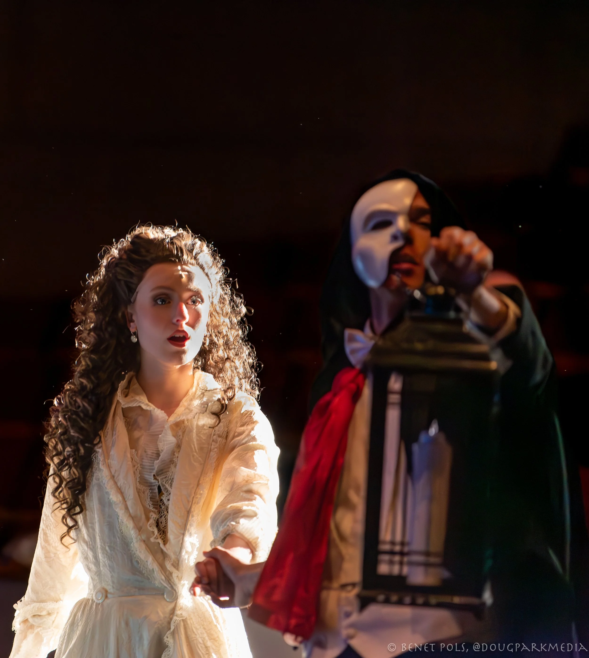
Darkening up the background and the shadows took some fine tuning. Going to straight black would have diminished the phantom to only his mask and shirt, but I wanted him to retain some substance. Remaining to plague me was the hot spot on Christine’s left side. I worked to darken the area by masking her shoulder and the left side of her face using a radial gradient, basically an oval, and making changes only within that oval. This is the result I got in March. I posted it and some others early the next morning and sent the same batch to the radio station.
BHS Players did full, lighted, dress rehearsals on Monday, Tuesday, and Wednesday before opening on Thursday. They did a total of six performances over two weekends. I photographed two dress rehearsals (Monday and Tuesday) and the second Friday show. I also went to the opening night performance but did not bring my camera. Dress rehearsal is fascinating. The level of control exercised by the student techs running the board was impressive; I had always assumed this was likely the domain of moonlighting adult pros. Watching one of the directors, or member of the crew walk right across stage during the action to check on something interested me; the performers simply ignored the intrusion. I had expected an empty theatre but was surprised to see two bus loads of students from other schools filling the seats. On the first night of rehearsal one of the leads was absent, an actor with a role opposite the absent actor, chose to sing both parts to preserve his own rhythm and timing..
One advantage to subscribing to the Adobe Creative Suite is that it continually upgrades—good features get better. New features are beta tested with subscribers and tweaked. The masking feature in Lightroom is far more precise now than even just a few months ago. Noise reduction, which had involved a series of sliders and some guess work, has evolved. Recalling the noise in this image when I edited it back in March I came back to it to give it another run after some upgrades to the noise reduction features of Lightroom.
Noise is often more evident in the darkest areas of files shot at high ISO. For me, two types of work I do generate a significant low light, high ISO images. Stage performances of any type and sporting events shot under the lights. A trick to getting around this is simply to sacrifice the dark areas and move the shadow, contrast, and black level up so those areas are dark enough that the grain disappears. This method has a particular advantage if you are shooting a stage production from the side. Shots across the stage are great when you want to get the facial expressions, or get behind what is happening in the foreground. The downside is that the background of a side view often includes distractions that are not part of the play: emergency lighting, signage, things behind the props, or people standing around back stage. Again, this are things that the mind’s eye stifles while viewing but they can diminish a photograph.
But now, I could remove the noise without removing all of the background detail. This is the same file edited in July with the benefit of some slightly better tools and more time to spend on it.
By no means perfect, but this July edit won the approval of a highly scientific unanimous jury of instagram followers.
Pros:
Retained the glow in Christine’s gown;
Good detail on the shaded side of Christine’s face and depth in shadowed portion of her hair (Okay, wig);
Good reduction in the overexposure of the left side of of Christine’s face and hair;
Less need to combat noise by darkening the phantom allows more depth to the contours of his body and costume, notably the red scarf and the lantern.
Cons:
The warmth added to the left side of Chrsitine’s face to coax out some depth changes the mood a bit; this version of /Christine seems less dubious about the phantom than the starker contrasty version from March;
Bringing up the detail in the phantom accentuates the shallow depth of field. Shooting at 200mm at f/2.8 makes for a very shallow window of crisp focus. Only the plane of Christine’s torso and head is sharp, even her left forearm loses crispness. The phantom is blurry.
But….I can always come back to this file another quiet day:
”The real voyage of discovery consists not in seeking new lands but seeing with new eyes.”
-Marcel Proust


